SwifCash
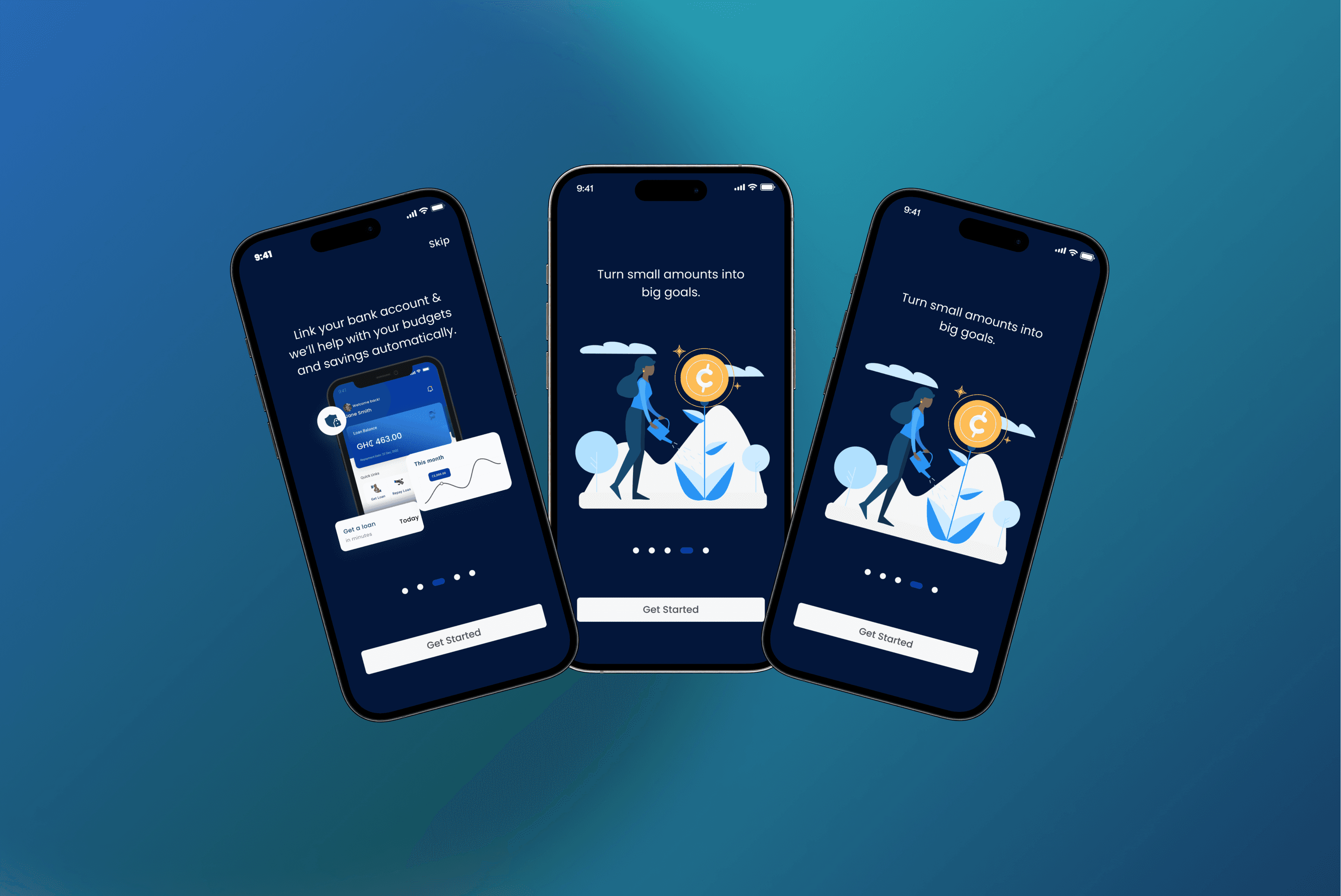
SwifCash is a mobile application that enables users to apply for and repay loans, as well as save and invest, all from the comfort of their homes.
SwifCash is a fintech mobile application that enables users to apply for and repay loans, save money, and invest directly from their mobile devices. The goal was to create a seamless digital financial experience that eliminates the need for physical bank visits while making financial services accessible, intuitive, and secure.
Traditional loan application processes are often slow, paper-based, and require users to visit physical branches. Many users also struggle to manage savings and investments because financial products are fragmented across multiple platforms.
The challenge was to design a single mobile experience that allows users to:
Apply for loans quickly
Repay loans conveniently
Save towards financial goals
Invest with confidence
Track all financial activities from one dashboard
while maintaining trust, security, and ease of use.
1. Discovery
Stakeholder interviews
Business requirement gathering
Market research
Competitive analysis of digital banking apps
2. Research
User interviews
Persona creation
User journey mapping
Pain point identification
3. Define
Prioritized user problems
Feature prioritization
Information architecture
User flows
4. Design
Wireframes
Low-fidelity prototypes
High-fidelity UI
Interactive prototype
5. Validate
Usability testing
Iterative improvements
Accessibility review

We believed that if users could access loans, savings, and investment products through a single intuitive mobile application with a simplified application process, then:
Loan applications would increase.
Loan completion rates would improve.
Users would save more consistently.
Users would engage with investment products.
Customer satisfaction would increase due to reduced friction.
Several concepts were explored before settling on the final experience.
Ideas Explored
Option A — Feature-Based Navigation
Separate sections for Loans, Savings, and Investments.
Challenge
Users needed to constantly switch between sections.
Option B — Dashboard First
A personalized dashboard showing financial health, active loans, savings, and investments.
Outcome
This became the preferred approach because users could immediately understand their financial position.
Additional design explorations included:
Different loan application flows
Repayment progress indicators
Savings goal visualization
Investment portfolio cards
Transaction history layouts

Business Constraints
Compliance with financial regulations.
Strict KYC (Know Your Customer) requirements.
Integration with existing banking infrastructure.
Tight development timelines.
Technical Constraints
Limited API capabilities during early development.
Need for secure authentication.
Support for low-end Android devices.
Variable internet connectivity.
Design Constraints
Complex financial workflows needed to remain simple.
Financial terminology had to be understandable for non-expert users.
Accessibility and readability across different age groups.
The project would be considered successful if it achieved:
User Metrics
Higher loan application completion rate
Reduced onboarding drop-off
Increased savings plan creation
Increased investment participation
Higher monthly active users
Experience Metrics
Reduced task completion time
Improved usability scores
Lower support requests related to navigation
Higher customer satisfaction (CSAT)

Objectives
Evaluate whether users could:
Apply for a loan without assistance.
Understand repayment schedules.
Create savings goals.
Find investment opportunities.
Navigate between financial products.
Participants
5–8 participants representing different levels of financial literacy.
Key Findings
Users appreciated:
Clear loan progress indicators.
Simple onboarding.
Dashboard overview.
Visual savings goals.
Areas for improvement:
Simplified financial terminology.
Larger touch targets.
More prominent repayment reminders.
Better explanations of investment risks.
These insights informed several iterations before development.
The final product delivered a streamlined digital finance experience where users could:
Apply for loans in minutes.
Track loan status in real time.
Repay loans digitally.
Create and monitor savings goals.
Invest from the same application.
Manage their finances through one unified dashboard.
The design reduced complexity while building trust through clear information, transparent processes, and consistent visual feedback.
This project reinforced several important design principles:
Financial products should be explained using simple, everyday language.
Trust is built through transparency, not just branding.
Breaking complex processes into smaller steps reduces user anxiety.
Continuous user testing uncovers usability issues that assumptions often miss.
Close collaboration between design, engineering, and product teams leads to smoother implementation and a better user experience.